My last week at work was a bit strange. I got ill on Tuesday so I had the day off. For the rest of the week I felt a bit better, and I had work to get done, so I just worked from home. I didn’t even feel well enough to go into the office on Friday, my last day with the company. I still felt a bit ill over the weekend. It wasn’t until Monday that I really felt alright again. I’d planned to start work on my own exciting projects on Monday morning. But after a week of being stuck inside I was craving fresh air and exercise and didn’t want to spend another day just sat at my desk working. So I decided to go for a walk.
I drove to Hadleigh Country Park, which is about half-an-hour from where I live. I’d never been there before. I found out about it from a book of local walks I bought at the supermarket a while ago.
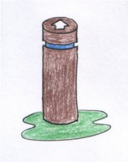
They have 3 marked walks you can follow. At the start a sign tells you how long each one is. People must walk really slowly because it turned out that they vastly overestimated how long each walk would last. The walks are colour coded: white, blue and black. There are posts along each route, with a coloured band for the route and an arrow carved out of the top showing you which direction to walk in. I neglected to take a photo so here’s a sketch.
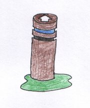
At the start and end, the routes overlap, so sometimes you see a post with two or more coloured bands. Because I was so quick, I walked both the blue and the black routes.
At one point, I wondered if you could do the walks backwards. No, I don’t mean walking backwards, but starting at the end and following the waypoints in reverse. I guess you might want to do this if you walked there a lot and got bored with the same old routes. Walking them in reverse would give you a different set of views to look at. But I realised that you’d have a problem in this scenario. Let’s say waypoints 6, 7 and 8 are arranged like this (I’ve numbered them for convenience here. The real ones weren’t numbered):
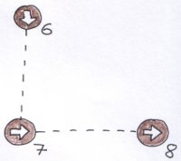
If you try to walk from 8 to 7, when you get to 7 you don’t know which direction to walk in to get to 6. You’d have to guess and would probably get lost. Well I would, anyway. So each trail is uni-directional.
I began to realise that the system of trails and waypoints is really a user interface, and I spent the rest of my walk thinking about the design decisions and trade-offs the designers had made.
One of the major advantages of the system is that all the posts are simple, and are (almost) all the same. For the posts on a single route, they are all exactly the same shape, with only the colour band differing between posts on different routes. This must be convenient for maintenance, because you can keep a few spares lying around, and when a post needs replacing you just paint the colour band and stick the post in the right place, pointing the arrow in the right direction.
I could imagine various additional information that it might be useful to include on each post, such as the direction of the previous waypoint (for following the routes in reverse), or how far you are along the route. But each of these would require making each waypoint different from all the others. To indicate previous waypoints, you’d need two arrows, and the angle between them would differ for each post. To indicate progress, you’d need a different number on each post. So you lose the major advantage of having every post identical.
They do have different types of posts for where routes overlap, because those posts have 2 or 3 colour bands on them. Here the trade off is between having posts with multiple colour bands against making 3 separate posts and putting them all in the ground at the same place.
Another design decision was to do with the direction arrows on top. The white arrows on top were hard to see from a distance. I had to go right up to each post to see where it was pointing. But I can see the advantage of this system rather than having a sticky-out arm or something. The arrows were carved out of the post itself, so they couldn’t break off, and would still be usable even if the white paint wore off.
![]()
One of the problems I had when following these trails was finding the next post. There tend to be a lot of brown posts in the countryside! Especially near gates and fences, which is where the waypoints tend to be. These brown posts don’t stand out very much. This is another design trade off. More distinctive posts would be easier to spot, but would also look less attractive in the countryside setting.
The only thing I thought could be improved was the colours used for the routes. At one point I got a bit confused and thought I might be lost. I saw a post up ahead but couldn’t tell from a distance whether it was blue or black. Those two colours are quite similar. Maybe they should have chosen red instead for one of the colours.
But overall it was clear that a lot of thought and care had gone into the design of these walks.
TL;DR